Font size custom
with classes .fs-* utilities only apply font-size.
| class | usage | example | size | size px | default | variables |
|---|---|---|---|---|---|---|
fs-1 |
<< /code> |
Font size 40px | 2.5rem |
40px |
$h1-font-size |
|
fs-2 |
<< /code> |
Font size 32px | 2rem |
32px |
$h2-font-size |
|
fs-3 |
<< /code> |
Font size 24px | 1.5rem |
24px |
$h3-font-size |
|
fs-4 |
<< /code> |
Font size 18px | 1.125rem |
18px |
$h4-font-size |
|
fs-5 |
<< /code> |
Font size 16px | 1rem |
16px |
$h5-font-size |
|
fs-6 |
<< /code> |
Font size 14px | 0.875rem |
14px |
$h6-font-size |
with heading classes (.h1 - .h6) utilities apply font-size,
font-weight, and line-height
| class | usage | example | size | size px | default | variables |
|---|---|---|---|---|---|---|
h1 |
<< /code> |
Font size 40px | 2.5rem |
40px |
$h1-font-size |
|
h2 |
<< /code> |
Font size 32px | 2rem |
32px |
$h2-font-size |
|
h3 |
<< /code> |
Font size 24px | 1.5rem |
24px |
$h3-font-size |
|
h4 |
<< /code> |
Font size 18px | 1.125rem |
18px |
$h4-font-size |
|
h5 |
<< /code> |
Font size 16px | 1rem |
16px |
$h5-font-size |
|
h6 |
<< /code> |
Font size 14px | 0.875rem |
14px |
$h6-font-size |
Font weight custom
Where weight is one of:
| class | name | usage | example | weight | default | variables |
|---|---|---|---|---|---|---|
fw-100 |
lighter |
<< /code> |
Font weight lighter |
100 |
$font-weight-lighter |
|
fw-300 |
light |
<< /code> |
Font weight light |
300 |
$font-weight-light |
|
fw-400 |
normal |
<< /code> |
Font weight normal |
400 |
$font-weight-normal |
|
fw-500 |
thick |
<< /code> |
Font weight thick |
500 |
$font-weight-thick |
|
fw-700 |
bold |
<< /code> |
Font weight bold |
700 |
$font-weight-bold |
|
fw-900 |
bolder |
<< /code> |
Font weight bolder |
900 |
$font-weight-bolder |
Theme color custom
Normal button
                        << /code>button class="btn btn-primary">btn-primary
                                << /code>/button>
Outline button
                        << /code>button class="btn btn-outline-primary">btn-primary
                                << /code>/button>
Background, border and border radius
{ background-color:
                #ffffff;}
bootstrap variable { $white }
border - border-color
{ border: 1px solid #dfe1e6;}
this border is default brand variable { $brand-gray }
rounded-3 - border-radius
{ border-radius: 0.5rem }
{ background-color:
                #f4f5f7;}
brand variable { $brand-light }
border-brand-dark - border-color
{ border: 1px solid
                #dfe1e6;}
brand variable { $brand-gray }
rounded-3 - border-radius
{ border-radius: 0.5rem }
Spacer custom
Spacing utilities that apply to all breakpoints, from xs to xl, have no breakpoint
abbreviation in them. This is because those classes are applied from min-width: 0 and up, and
thus are not bound by a media query. The remaining breakpoints, however, do include a breakpoint
abbreviation.
The classes are named using the format {property}{sides}-{size} for xs and
{property}{sides}-{breakpoint}-{size} for sm, md, lg,
and xl.
Where property is one of:
m- for classes that setmarginp- for classes that setpadding
Where sides is one of:
t- for classes that setmargin-toporpadding-topb- for classes that setmargin-bottomorpadding-bottoml- for classes that setmargin-leftorpadding-leftr- for classes that setmargin-rightorpadding-rightx- for classes that set both*-leftand*-righty- for classes that set both*-topand*-bottom- blank - for classes that set a
marginorpaddingon all 4 sides of the element
Where size is one of:
0- for classes that eliminate themarginorpaddingby setting it to01- for classes that set themarginorpaddingto$spacer * .25rem=4px2- for classes that set themarginorpaddingto$spacer * .5rem=8px3- for classes that set themarginorpaddingto$spacer * .75rem=12px4- for classes that set themarginorpaddingto$spacer = 1rem=16px5- for classes that set themarginorpaddingto$spacer * 1.5rem=24px6- for classes that set themarginorpaddingto$spacer * 2rem=32px7- for classes that set themarginorpaddingto$spacer * 3rem=48pxauto- for classes that set themarginto auto
Examples
-
<< /code>div class="m-0"><< /code>div>margin allm-0=0 -
<< /code>div class="mt-1"><< /code>div>margin topmt-1=0.25rem=4px -
<< /code>div class="mb-2"><< /code>div>margin bottommb-2=0.5rem=8px -
<< /code>div class="mx-3"><< /code>div>only margin left and rightmx-3=0.75rem=12px -
<< /code>div class="my-4"><< /code>div>only margin top and bottommy-4=1rem=16px -
<< /code>div class="pe-6"><< /code>div>padding rightpe-6=1.5rem=24px -
<< /code>div class="ps-8"><< /code>div>padding leftps-8=2rem=32px -
<< /code>div class="m-0 m-sm-7"><< /code>div>margin 0 on xsm-0and from smm-sm-7=3rem=48px -
<< /code>div class="mx-n4"><< /code>div>margin horizontaly negativemx-n4=-1rem=-16px
For negative use prefix " n " before size
Margin bottom mb-0 = 0px ili 0rem
Margin bottom mb-1 = 4px ili .25rem
Margin bottom mb-2 = 8px ili .5rem
Margin bottom mb-3 = 12px ili .75rem
Margin bottom mb-4 = 16px ili 1rem
Margin bottom mb-5 = 24px ili 1.5rem
Margin bottom mb-6 = 32px ili 2rem
Margin bottom mb-7 = 48px ili 3rem
Please press Ctrl + Shift + R to re-render an MDN page.
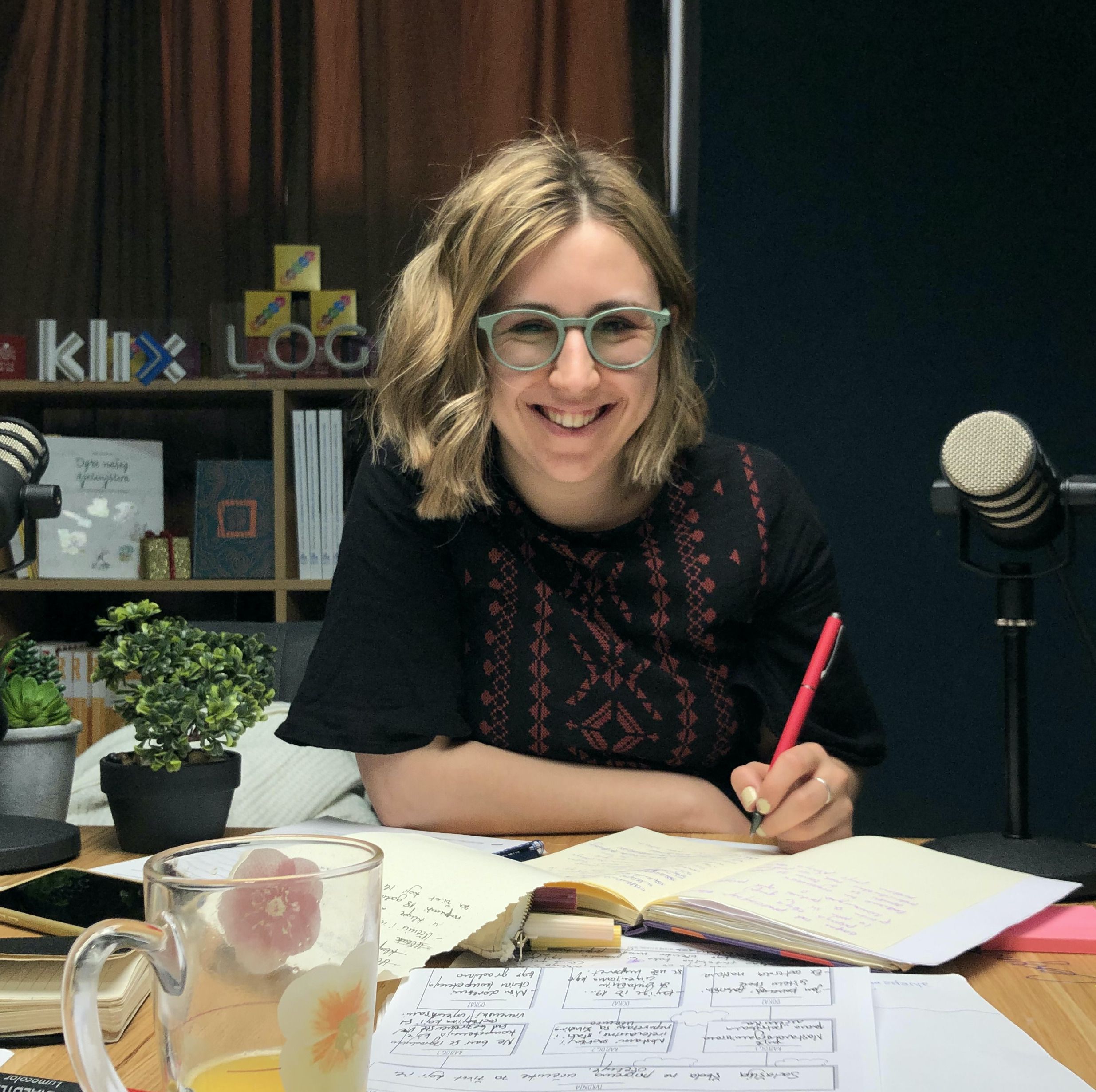
Pedagoginja (B.Ed) / Koordinatorica projekata @ COI Step by Step
Rođena sam i odrasla u Sarajevu, gdje sam završila pedagogiju na Filozofskom fakultetu. Trenutno sam studentica master studija sociologije na Fakultetu političkih nauka Univerziteta u Sarajevu. Moj aktivistički put započeo je u Asocijaciji srednjoškolaca BiH, gdje sam u mandatu 2016/17 bila i predsjednica. Kroz godine sam sarađivala s Fondacijom Schüler Helfen Leben na programu omladinskog obrazovana, a radila sam i kao edukatorica i vodičica u Muzeju ratnog djetinjstva.
Danas sam dio tima Centra za obrazovne inicijative Step by Step, gdje radim na razvoju Inškole, Zajednice inovativnih nastavnika i nastavnica, te programa profesionalnog razvoja i stručnog usavršavanja. Posebno me zanimaju obrazovne politike, inovacije u obrazovanju i načini na koje društvo oblikuje učenje. Volim razgovarati o obrazovanju – uvijek mi se možete javiti ako želite podijeliti ideju, postaviti pitanje ili zajedno razmišljati o nekom obrazovnom izazovu!
Član od 03.2023.
Project assistant @ COI Step by Step
MA Specijalne pedagogije
Članica Zajednice inovativnih nastavnika i nastavnica
Administratorica InŠkole
Član od 11.2023.

Mjesto gdje se spajaju ljudi, rađaju ideje, kako bi stvarali dobro obrazovanje i čuvali radost djetinjstva za svako dijete.
Centar za obrazovne inicijative "Step By Step" je strukovna, nevladina organizacija osnovana s ciljem promicanja obrazovne filozofije usmjerene na dijete i prava svakog djeteta na kvalitetan odgoj i obrazovanje na području cijele Bosne i Hercegovine.
Centar djeluje od 1996. godine, kada je osnovan uz potporu Fonda za otvoreno društvo, a od 1999. godine registriran je kao samostalna udruga.
Nakon 25 godina aktivnog rada u obrazovnom sustavu Bosne i Hercegovine, COI "Step By Step" prepoznat je kao jedna od vodećih organizacija u području stručnog usavršavanja nastavnika, unapređenja kvalitete obrazovanja i promicanja vrijednosti i principa socijalne pravde. Za podršku programima usavršavanja Centar je do sada objavio preko 50 različitih publikacija, stručne literature, priručnika za nastavnike, analiza i izvješća.
Centar je aktivan i prepoznat u cijeloj Bosni i Hercegovini, kroz razgranatu mrežu nastavnika, škola i certificiranih trenera, dakle kroz suradnju s drugim domaćim i međunarodnim organizacijama, kao i ministarstvima obrazovanja i pedagoškim zavodima.
Član od 02.2025.

Projektni asisten u COI Step by Step
Vaš dežurni psihoterapeut u Step by Step-u...
Član od 02.2025.

profesor matematike i informatike.Član ekspertnog tima-predmetna nastava.Grupa za podršku i interakciju
Član od 03.2025.

Učiteljica razredne nastave, Član ekspertnog tima - Razredna nastava - Radna grupa za kreiranje sadržaja
Rođena, odrasla i još uvijek živim u Grudama. Radim u osnovnoj školi koju sam pohađala kao dijete.
Na svom profesionalnom putu sam putovala kroz obrazovanje u svim mogućim ulogama - od učenika, roditelja, učitelja, ravnatelja škole pa sve do obrazovnih vlasti. Te različite perspektive su me navele na zaključak da odrasle ne možemo promijeniti, ali od današnje djece možemo stvoriti ljude koji će voditi svijet kakav danas sanjamo.
Volim učiti, sustav nije uništio radoznalost djeteta u meni. Takvu radoznalost nastojim njegovati kod svojih učenika.
Aktivno sudjelujem u kurikulskoj reformi (županije u kojima se nastava izvodi na hrvatskom jeziku) kao član radnih skupina za izradu predmetnih kurikula za predmete Hrvatski jezik, Priroda i društvo te Kultura življenja, te kao koordinator međupredmetnog područja. Izvodim edukacije za planiranje i izvođenje nastave prema novim kurikulima. Suatorica (Matematika) i recenzentica (Hrvatski jezik i Priroda i društvo) novih udžbenika za razrednu nastavu.
Član od 03.2025.

Nastavnik matematike, OŠ "Cazin I" Cazin i član Radne grupe za za procjenu i unapređenje sadržaja ( predmetna nastava).
U fokusu su mi igre u nastavi matematike i stvaranje učionica matematičkog promišljanja.
Član od 03.2025.

Pedagog u JU DV "Čika Jova Zmaj" u Foči
Član ekspertnog tima - predškolstvo
Dobitnica NIN-2017. Praksa "Zmajevi izviđači"
Diplomirani pedagog i andragog, diplomirani vaspitač predškolske djece i zaposlena u JU Dječiji vrtić "Čika Jova Zmaj" u Foči. Kao vaspitač sam radila 10 godina, a trenutno obavljam posao pedagoga. Tokom svog rada trudila sam se da djeci ne budem samo učitelj, već mentor i prijatelj koji sa strpljenjem i pažnjom oblikuje njihove karaktere i pruža im sigurnost na početku njihovog najvažnijeg životnog puta.
Nikad ne smijemo zaboraviti da su djeca naša budućnost, a mi njihova prošlost i sadašnjost, što im damo danas oni će to ponijeti u svoj svijet sutra.
Član od 03.2025.

Profesor fizike
Nacionalni koordinator Sv sedm svemira za BiH
https://stemklub.weebly.com/?fbclid=IwAR0Pwulv9zpP6TYtbiPEkk
Član od 03.2025.

Profesor razredne nastave. Član ekspertnog tima - razredna nastava. Grupa za podršku i interakciju.
Član od 04.2025.


